Branding is the way in which an entity—whether it is a university or a shoe company—presents itself to the world over time. Branding is more than using a specific logo, color, or typeface. It is a consistent, yet evolving, set of elements that work together to create and maintain a desired emotional and intellectual connection with an audience.
Consistent branding goes beyond making the university’s materials more readily recognizable. Effective branding moves people. By communicating in a consistent, compelling manner, we can move potential students, faculty, alumni, business leaders and donors to understand, admire, and participate in the Winston-Salem State University experience.
The shield. The shield represents the strength of the Winston-Salem State University community and reflects the faculty and staff’s commitment to advocating for students and providing them a safe and supportive environment in which to pursue their education.
The arch. The arch symbolizes the history and traditions of the university. In a tradition spanning decades, students who arrive on campus as freshmen are led through the Archway near Hill Hall during a ceremony that signifies their transition from “Lambs” to “Rams.”
The skyline. The City of Winston-Salem skyline seen through the archway symbolizes the university’s commitment to community engagement and its desire to be responsible neighbors and strategic partners with the city, the region, and beyond.
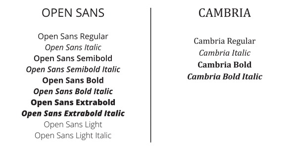
The typefaces. The two typefaces were selected for their ability to convey two important things: that WSSU is a bold, vibrant, and exciting university and that it is grounded in a rich tradition of providing a high-quality liberal education.
Winston-Salem State University recommends the following typefaces for use in publications: Cambria as the serif font and Open Sans as the sans-serif font. Other fonts must be approved by the Office of Integrated Marketing and Communications for use in university publications.

Primary
 PMS: 186
CMYK: 2 100 85 6
HEX: #c8102e
RGB: 200 16 46
Secondary
|
PMS: Cool Gray 6 |
PMS: White |
PMS: Black |
Brand Guidelines
Template Files
Brand Frequently Asked Questions
The last time the university’s visual identity was refreshed was in the early 2000s. That refresh was a simple iterative change from an existing identity that was already over a decade old. In the time since that identity was rolled out, the university has evolved and grown. We are so much more than a red box. Meanwhile, we have not had any consistent, articulated brand messaging to describe what makes WSSU special.
It has never been more critical to have a strong brand. The university faces:
- decreasing financial support from the state
- continued discussion on the value of historically Black universities
- increasing competition for students
A strong brand helps:
- raise the profile of the university
- raise awareness for the university and its value to the state, region, and world
- improve the value of a degree from WSSU by demonstrating and sharing the quality of our academic programs and the successes of our alumni
- position the university to be considered among the best in the state – with the goal of garnering greater support from lawmakers, corporate partners, and major donors
- inspire advocacy and support from alumni and friends
While a large volume of the work on this project has been completed over the past year, the process actually began in 2012. At that time, surveys of students, alumni, faculty, and staff were conducted. The results of those surveys provided a starting point for continued research.
During the 2015-2016 academic year, we reviewed data from many additional surveys of not only the university community and alumni, but also incoming freshmen. In addition to informal discussions with faculty, staff, and students, we held formal focus groups soliciting feedback and gathering information. All of that information was analyzed and synthesized to create the final product.
No. The university’s colors are still red and white. The shade of red on marketing communications materials has been tweaked slightly. We have shifted to Pantone 186, which better reproduces as a red than the previous Pantone color.
No. In an effort to be as cost-efficient as possible and to support our sustainability efforts, we are encouraging the campus community to use their existing supplies using the current logo rather than discarding materials.
There are several important goals we are working toward with our brand refresh.
- Increase positive perceptions of the university state-wide
- Increase pride in the university among students, faculty, staff, and alumni
- Recruit high-caliber students, faculty, and staff
We plan to conduct a benchmark survey before we roll out an advertising campaign this fall. The survey will assess both perception of the university as well as general awareness. We will repeat this study in two years to determine the impact of the brand refresh. We will also look at a variety of other metrics, including website visits and admissions inquiries.


